I like illustrating interaction or moderation effects with formulas as I think it is the most clear way.
Previously we examined this model with regression

Statistically, it is expressed by this regression model:

The moderated regression model is

Sometimes it’s called interaction because the term 
For (1), the equation is like

You can know mathmatically, this equation is the same as the prior two actually. One thing changed is the coefficient of media use is dependent on education 
Alternatively, (2) is also reasonable because the moderated regression model is equivalent to
The the coefficient of education is now 

To judge whether there is interaction/moderation effect or not, just refer to the p-value of the interaction term. If you are going to calculate it manually, you can mean center them first and calculated the interaction term and then treat the interaction term as one independent variable and do the OLS regression like my previous post. But for convenience, I’m going to illustrate how to do and plot this with PROCESS Macro Model 1.
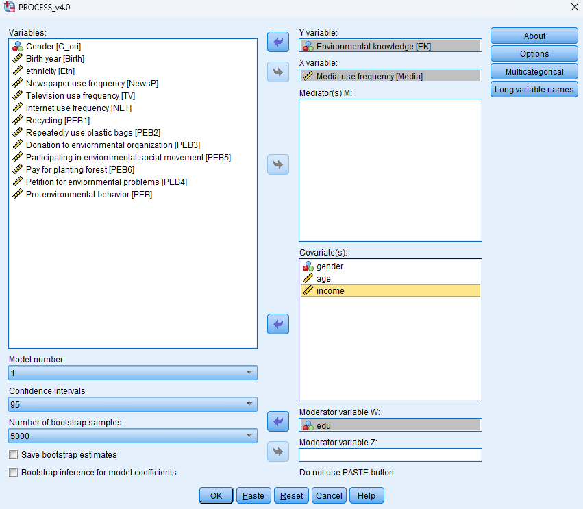
I continue using the same sample data about environmental knowledge to demonstrate this.
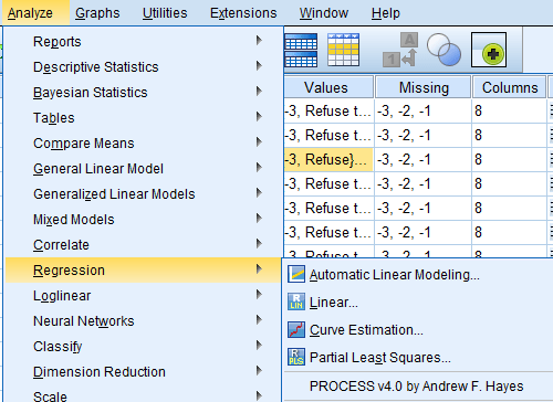
If you have successfully installed PROCESS Macro in your SPSS…Open it through Analyze -> Regression -> PROCESS.
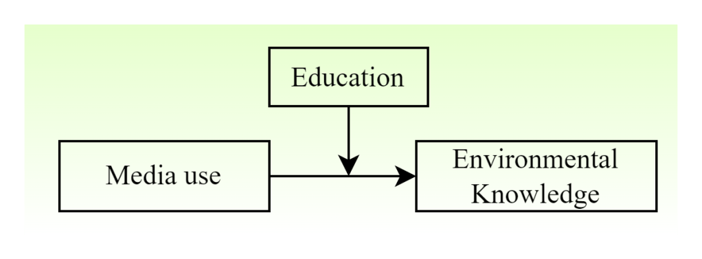
Recall the Model 1. W is the moderator, X is the independent variable, and Y is the dependent variable. So here I’m going to choose edu as the moderator, X is media and Y is environmental knowledge.
In PROCESS results, it is equivalent to

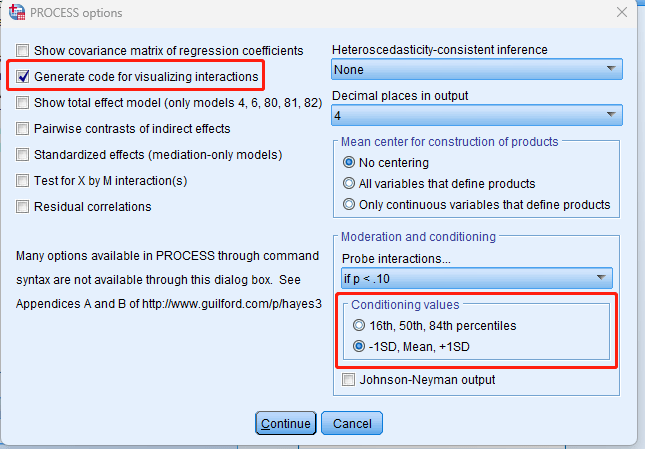
In options, check “Generate code for visualizing interactions.” I changed the conditioning values as well but it depends.
Then we get the results like below:
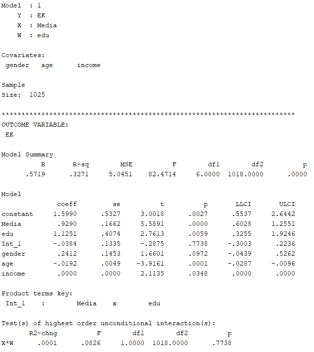
We can see the interaction term is not significant (p=0.7738). Hence, we cannot reject the null hypothesis that the coefficient of the interaction term is 0. That is, the coefficient of the interaction term is possible to be 0. We did not find any interaction/moderation effect in this model.
We can also get the code for plotting at the last.
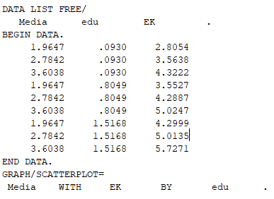
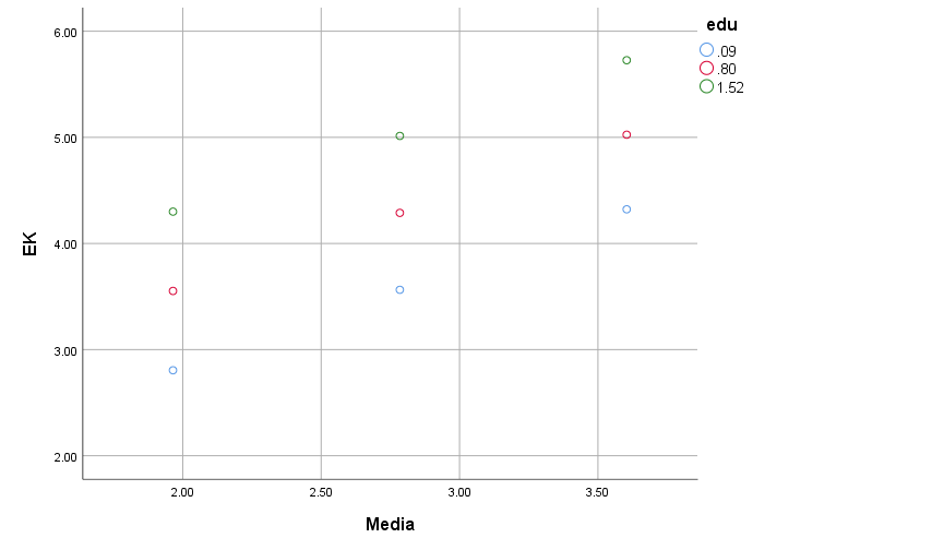
Copy the code and open “File -> New -> Syntax”, paste and run, and you can get the graph. You can edit the graph in SPSS. It’s not very convenient, but it’s my common way.
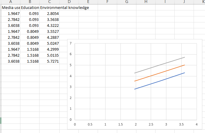
But alternatively, you can use excel to plot the figure as long as you know what the numbers in the code means.
Actually it’s quite easy…The first column is the media use points, the second is the education, and the third is the environmental knowledge. You can see from the SPSS plot that, basically the interaction plot is plotted with 9 points. It can be plotted with excel “scatter plot(散点图)” add the numbers. Then it’s the art of Excel….
Note that there are many ways to plot interaction effect, and there are many tools online. My supervisor developed one for continuous variables’ plotting. It requires mean centering. There are also other tools. You can explore them online.

Leave a comment